Saturday, 28 March 2015

Capture Life - Week 1: Good morning, good night

I have to admit that I haven't done much (any!) papercutting since my last map commission. I have a lot of ideas and I feel like I'm always thinking about new pieces but I haven't put blade to paper and made anything happen yet. 

Partially to blame for my lack of productivity on the papercut from was that this week I started the Capture Real Life in 52 Weeks challenge from A Beautiful Mess. I've talked about this before but basically this is a self paced course that gives a prompt for photos each week. This is great for someone like me who's only really taken picture of food and the odd shot of a landscape in the past few years. 

So I don't intend to share all the photos I take for this challenge, and maybe not all the weeks, but it has been fun to look over the prompts (I looked ahead - is that cheating?) and see which ones I'm excited for and which ones I know will be hard for me.

This was week 1 and the theme was 'Good morning, good night'. I found this more challenging than I initially thought. I'm not a morning person and my mornings aren't mainly consist of me scrabbling around to find a suitable outfit and racing out the door without brushing my hair - not really conducive to photos! 

But in thinking about my mornings I realised I do really enjoy my commute, which is not something everyone can say! It's a regular part of my morning and I like the process of travelling into London. 


These two photos frame my commute. The Regency Cafe is a famous London greasy spoon that is around the corner from my work and always busy. Check it out if you are ever in town. 

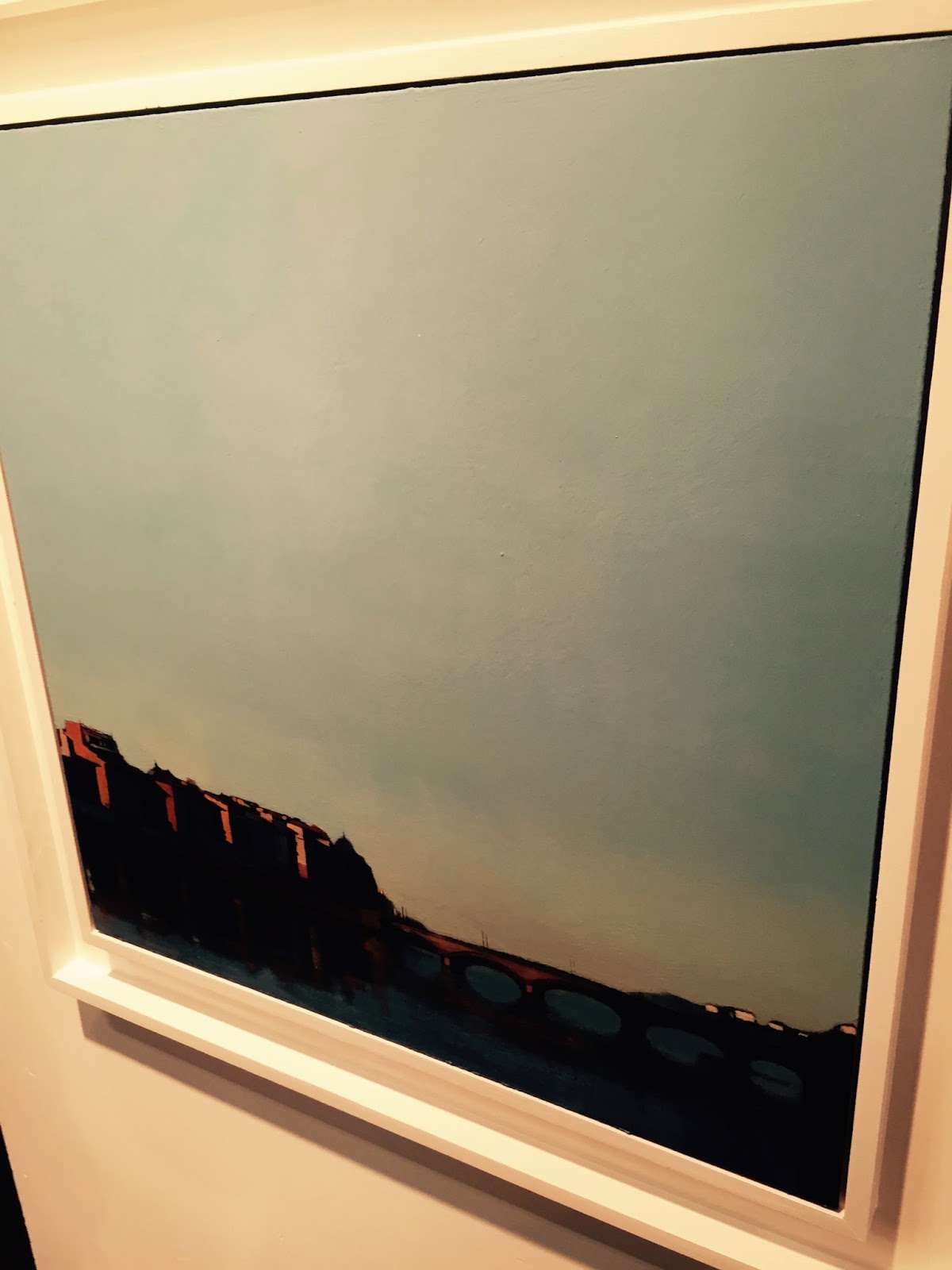
To be honest, 'goodnight' wasn't much easier. I think in the first week of this challenge I have realised that I spend a lot of time rushing about and not much time appreciating where I am at the time. 


I do appreciate out flat. James actually saw it and we accepted it without my having viewed it, which was high risk but luckily paid off. 

As we are in a 1930's estate it's lovely and quiet, something we haven't had in any of our other London homes. 

This is a late winter evening overlooking the communal courtyard area. 

Roll on summer. 


Saturday, 14 March 2015

Affordable Art Fair - Battersea Park

Last week we headed off to the Affordable Art Fair in Battersea Park. I've been going to the fair for years and it's always been really interesting and fun (there is free wine too!). 

This time was no exception. I love seeing what other artists are doing, themes that repeat themselves...mediums that are gaining in popularity. And it's huge, there is a great range of galleries and types of art. 

I stupidly forgot my camera so I had to ask James to take pictures of some of my favourite pieces while we juggled bags, coats and tried not to slosh wine over ourselves, other guests and nearby paintings. 

Below are a couple of the pieces that we especially liked, sorry in advance for the long post!


This landscape by Jonathan Purday was one of the first things that caught out attention. There was a few of his landscapes in the gallery and they were large and striking. Apparently he's influenced by David Lynch films. 

James said that he could see different animal faces in the rock - this was early in the wine drinking too! 


This next piece (right) had me scurrying across the room to check it out. You wouldn't know from a distance but this is mixed media but from what I could see, mainly a collage of paper and in the foreground as the darker bits of beach, dead leaves!  The photo doesn't really do it justice, it was so impressive. Even all the little houses in the background were build up from paper!

The artist is Kate Aggett. Apparently she has previously designed knitwear and textiles before moving into these landscapes and seascapes.

As someone who works in paper myself I love seeing how other artists use this medium. 


More paper! And so interesting. Again, hard to do justice to the piece in this photo, but this was a quite a large and the oblong shapes are slices of rolled up paper (this is what it looked like anyway). 

The artist is Amy E Genser, and piece is called 'Volcanic Tide'.

I think this approach is pretty great and really captures texture and the feeling of a volatile, bubbling lava flow. 


These ceramic pieces were in the same gallery stand and are by Michael Wisner. They were stunning. James really liked these, especially the grey one. The texture on them is incredible. 

I have to admit a massive ignorance of ceramics... these are apparently coil pots. Which I can only assume is the same sort of technique we all leaned in school with clay. I remember those pots were one of the first times in my life (aged 12 or so) when I truly felt frustrated in art class! 

Anyway, this was probably not the experience that Michael had given how awesome these turned out...


Sorry about this picture, the angle was awkward. 
This was very liked by both of us - I love this super simple stylistic approach. And I have been thinking about Arctic landscapes a lot recently (I have no idea if this is the Arctic, but it does smack of it).

It's by an art collective called 'Hey' from Barcelona. We um-ed and ah-ed about if we wanted to get this... its still a point of discussion...


Ugh. This photo comes nowhere close to doing this justice. The painting was prominently displayed on an outer wall in the walkway and it was super busy so James struggled to get a decent shot. 

It's by Benedict Doonan and its called 'Towards Pointe Trinita, Florence'

What you can't really see in the picture is the beautiful treatment of light on the riverside houses and the bridge over the water. I love how its almost like the subject is huddled at the bottom of the picture allowing this gaping sky above. 

I really loved this painting. 


This was super fun. It's entirely made up of matchbox cars. James and I had a lot of fun poring over this and finding the ones we had as kids. We totally forgot to take the name of the artist - sorry artist!


Finally, this massive painting (below) grabbed us as we were being ushered out of the Fair. The artist is Noemi Martin and I think she's based in Madrid. 

There were a few of here paintings of this magical bookshop. One other had a lovely tiled floor in it but it was this one and the sense of light pouring in from the door into this crowded, dusty space that really got me. 

It's so great that bookshops like this still exist and that artists are inspired to paint them. 


This sign was outside the Fair - and there was a bus, and a queue! I don't know where it was going but the passengers seemed pretty cheerful about it despite the depressing sounding destination! 

I guess it was the 'brouhaha bus'. 

Great night all in all with a wide range of different art - if you haven't been, you should.

Thanks AAF! We'll be back next year!


Sunday, 8 March 2015

Paper vs card (well, House of Cards)

Oops. it's been a while since my last post - I wish I could say I was submerged in creativity and have loads of new pieces to show for my silence but in actual fact, like much of the world I have been submerged in season 3 of House of Cards. 

I have been mulling over a few projects though, and I have been working on another custom map order - I'm really happy with this piece. It had an A road running through it that I picked out in yellow. I really like how this works with the slash of blue and yellow. 


In addition to Netflix, another hole I have fallen into is Project Life and scrapbooking... I have sort of always balked at the idea of scrapbooks, I don't know why - I remember when I was a kid one of my mum's friends inherited a Victorian scrapbook from a distant relative. We spent hours poring over it, reading the notes and imagining the woman's life back then. I only remembered that recently when I have been thinking about getting involved myself. 

Project Life does seem like a great way to get started...although it was still challenging to sit down with some photos, pocket pages and journalling cards. I think I find it hard to decide how to organise things - thematically? chronologically? I guess it's just something I'll figure out as I go?

I've tried a few pages so far - I'm pretty happy with them - maybe I'll share some here soon. 


Monday, 23 February 2015

Intro to the instax...

So a couple of weeks ago I very impulsively bought a Instax Neo Classic. This was partially motivated by signing up for the A Beautiful Mess e-course Capture real life in 52 weeks and my frustration that I only ever seem to have virtual photos these days. 

If you aren't familiar with the Fuji Instax cameras they are cute, chunky, instant film cameras. Anyway, so when it arrived I was super excited and loaded it up with the 10 photo cartridge and proceeded to take some very mediocre (and some downright terrible) photos. 

So I read some tips and adjusted my expectations and recently have taken a few that aren't awful...or, aren't as awful as my first. 

 I have just realised that taking photos of instant photos that aren't that good in the first place isn't going to be the best representation of how fun the camera is. 

It is a big hit though. The novelty of having a photo spat out seconds after you take it is such a crowd pleaser and makes giving the photo to someone after so much more satisfying than sharing it online. 
I think so far my photos have taught me a few things about the camera:

- group photos look like they are from the 90's (which I kind of love)

- photos will be darker than expected (I took a picture of snowy landscape and it came out black - weird) so make the most of the 'mode' settings to make them lighter

- there is a slight offset in what you view through the viewfinder and what comes out in the photo

- be prepared to use about 10 photos feeling your way around a camera. I have used lots of cameras from happy-snappy film cameras to old SLRs, digital and this is a different kettle of fish


To the right is my favourite photo so far. I love the contrast, colours and how it looks retro. I also really like this type of abstract architectural photo, so I guess that helps. James took the same photo with his iphone 6 and of course it was much crisper, brighter and vibrant - but I still prefer mine. 

Shop update! Birds, fish and flowers..

After a bunch of procrastinating and some annoying computer crashes I have finally updated my Etsy shop with some of the recent work I have been blogging about: the Hamsa, the white peacock and the Gannets and herring. 


It's fun to see these all laid out together. They are so different but there the themes of flowers, birds and fish that tie them all together. 


Wednesday, 11 February 2015

Gannet diving for herring - papercut

James and I watched the BBC show 'Alaska: Earth's Frozen Kingdom' the other night. We don't often watch nature documentaries which is crazy as we always love them when we do. 

I have always been a bit of a nerd about the natural world, James less so so it's fun to see his reaction to some scenes. One that prompted a lot of commentary was the huge herring shoals that get plundered by birds (gannets in this case) from above and larger fish from below. (James: 'Why are they all in this big crowd?! Seems like a bad idea, if I was a herring I'd be hiding in the reeds').

Anyway, the camera work is always amazing and I had the images in my mind for the rest of the night. 

Then, as often happens, all plans for other projects got shifted when I decided I had to do a papercut of the gannets diving for herring. I was also keen to try out my new Hygloss silhouette paper which arrived a few days ago. 

So, this was a bit of a different style for me. And I will freely admit that on about the 400th fish I was questioning my sanity. But all in all I am really happy how it turned out. It feels like I am pushing myself a lot and it's good.


Right, I'm off to sweep up a million little fish cut-outs that are all over the house. 

Tuesday, 3 February 2015

Finished Hamsa papercut

In what will hopefully be my longest ever work in progress (over 2 years!) I am massively relieved to have finally finished my Hamsa papercut. 

I had lots of other projects that I wanted to get on with but I made myself focus and get this done. Part of my hang up with this was that I had left all the fiddly little bits to the end and it just felt fussy and never ending!


I went back and forth over the borders. I finally settled on the tear drop shapes and I'm pretty happy with the way they turned out. 

As I mentioned in my first post about this piece, it's a bit of a departure from the conventional papercut approach where the whole piece is a continuous piece from a single sheet of paper. My Hamsa is made up of lots of smaller pieces, and man, it was hard. I can't count the number of flowers, dots and tears I lost in the process. Says a lot for the traditional method!

On the flip side though, it was fun to try something new. I especially liked building up the layers in in 'eye' and I love the lotus flower... I may need to get that incorporated into more pieces in the future. 

Glad to have this work in progress finally done! It will be in my shop soon...